I'm currently working on major improvements in the function and feel of the win probability graphs. For those who have been checking in on the NCAA tournament win probs, you may have noticed a "2.0 Beta" link last night.
The new graphs not only look a lot better, but also have added features such as hovering transparent tooltip boxes for game scores and time remaining, and crosshairs for precise win probs at each point in the game. The scoreboard for each game is now integrated with the graph, but it's still a work in progress. The color scheme is still in flux as well. (I'm going for the wood of the court and the dark orange of a basketball. My banner will need to change to match.) I'd appreciate any suggestions you might have for the layout or colors, etc.
This will also give you an idea of what the football site will look like this fall. But the football version will be even better, with play-by-play available at each point on the graph, plus added stats such as 1st down probability, expected points, and scoring probabilities for the current drive. But you might not have to wait until fall. Part of my plan this year is to build WP graphs for every NFL game since 2000.
The upgrade is thanks to a suggestion by Ken Roberts of the great site "Sports Club Stats." He pointed me toward a very handy web graphing tool. His site probably deserves its own post, but I'll plug it now anyway. Sports Club Stats does playoff projections for most pro leagues and graphs them from the start to end of the season. Just as a win probability graph tells the story of a game, Ken's graphs tell the story of a season. For example, check out the heartbreaking Bucs' or Redskins' graphs for last season.
Win Probability Site Upgrade
Passing Predictability Part 1
 In its simplest form, play calling in football is a game of two strategy choices--pass or run. Game theory teaches us that the mix between the two strategies needs to be unpredictable to be effective. Ideally, there should be an optimum ratio of running and passing based on the expected benefits and risks in any given situation. In this post, I'll examine the effect of predictability by comparing passing success when passes are most and least predictable.
In reality there are several different variations of runs and passes an offense can choose. And defenses don't have discrete strategy choices at all. They can select from a continuous range of strategy bias from run certainty to pass certainty. But for now, I'll limit my discussion to just the two most basic options.
Refresher
Consider the graph below from an earlier post on game theory in football. The horizontal axis of the graph represents a range of strategy choices for an offense. On the left is "always run," and on the right is "always pass." Between each extreme is a range of mixed strategies. Halfway between would be a balanced 50/50 run-pass mix.
The colored lines represent the utility to the offense of each of its strategy mixes when the defense chooses each of its own strategies. In this example, if the offense were to always run (left edge of the chart) and the defense always played a pass defense(red), the offense would be very successful. And if the defense always played run defense (blue), the offense would certainly suffer.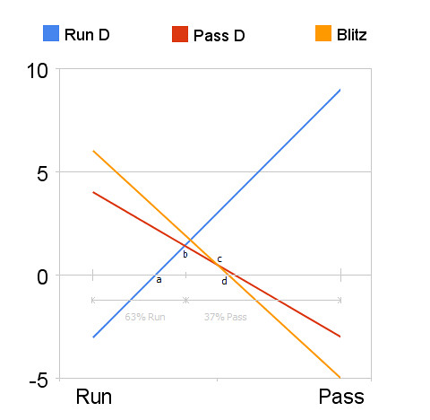
Keep in mind that yards do not equate with utility. Utility in football is ultimately win probability. The outcome of every play either increases or decreases a team's chances of winning. There are other considerations beyond yardage gained. For example, a 3 yard gain on 2nd and 2 may be better (higher utility) than a 4 yard gain on 2nd and 6. The risk of a turnover also has to be considered. But again, the analysis is always dependent on the situation and always assumes unpredictability. The benefit of the optimum strategy mix is lost if an offense repeatedly calls run-run-pass all game.
The Goal
What I really want to do is replace that example graph with a real one, based on real numbers. That might be something very useful. We could know truly optimum play calling mixes, or how to capitalize on opponent non-optimization. In a way, we could solve the 'game within a game' of play calling.
This is a Quixotic task, I realize. In fact, it sounds quite kooky. But we could narrow the focus enough and eventually begin to get some idea of what the utility graph looks like in certain situations. What we'd really need to do is nail down some of the critical values in the graph, such the endpoints of the utility lines at 100% run or 100% pass, or where the equilibrium point is.
Analysis
I decided to look at "10 yards to go" situations--1st and 10, 2nd and 10, and 3rd and 10 plays. When is passing least predictable? On 1st down. When is it most predictable? On 3rd and long.
All the numbers that follow are from all 10-yards-to-go scrimmage plays in the first 3 quarters of regular season games from 2000-2007. The only other limitation was that the game score was within 10 points. I wanted to exclude situations when teams exercised an abundance of either risk or caution.
Note the percentage of play types called on 1st, 2nd, and 3rd downs (with 10 yards to go). There is a fairly even split between run and pass calls on 1st and 2nd downs. On 3rd and 10, the a pass is far more expected.Type 1st 2nd 3rd Total Pass 47.2 52.7 91.1 49.6 Run 52.8 47.3 8.9 50.4
Although 91.1% isn't 100%, it's close to where the anchor point on the lower right side of the game theory graph--almost the pure pass vs. pass defense strategy combination. Now let's look at the average outcomes for these situations.Type 1st 2nd 3rd Total Pass 7.0 6.3 6.5 6.9 Run 4.2 4.4 6.9 4.3 Total 5.5 5.4 6.5 5.6
When passing is most predictable, it yields half a yard less than on first down, when it is less expected. Conversely, running is most successful when it is least expected.
At this point, I should point out that passing on 3rd and 10 yields slightly more yards than on 2nd and 10, which isn't completely what we'd expect. This is almost certainly because defenses will allow short complete passes on 3rd down in exchange for being relatively assured to be able to stop the gain short of 10 yards. This is part of the problem posed by the fact that yards does not equal utility. We'll have to dig a little deeper. The next table lists interception rate by down.1st 2nd 3rd Total Int Rate 2.6 2.9 3.5 2.7
Now we see more what we'd expect--a slight increase from 1st to 2nd down, then a large jump on 3rd down, in accordance with the associated increases in passing predictability. The next table lists adjusted yards per attempt, which is YPA with a -45 yd adjustment for every interception thrown. Adj YPA, however, still exhibits the same problem as plain YPA. It underestimates the drop off from 1st to 3rd down in passing effectiveness because defenses will allow gains, as long as they're not more than 9 yards.Type 1st 2nd 3rd Total Pass 5.9 5.0 4.9 5.6 Run 4.2 4.4 6.9 4.3
So what we can say is, the reduction in passing effectiveness due to predictability is likely at least 1 full adjusted yard per attempt. The drop from 1st down to 2nd was 0.9 yards, so the true reduction in effectiveness from 1st to 3rd down may be far larger.
Except that there's a problem with this analysis. There's a bias in the data. Which teams are more likely to face a lot of 2nd and 10s and 3rd and 10s? The ones that stink at passing. So the 2nd and 3rd down numbers are lower than would be representative of the league as a whole. In other words, poor passing teams 'get more votes' in the analysis.
Fortunately, I think I've solved this problem. I'll explain it in the second part of this article.
Live Tournament Win Probability
Don't be caught watching the games on your computer at work. Watch the WP graphs instead. You're supposed to be looking at things like graphs anyway!
Roundup 3/09
 The Fantasy Football Librarian ranks the purveyors of 2008 fantasy football projections. One thing I noticed is that no one set of rankings appeared consistently near the top of the lists for the various positions. This tells me that none of these services really know anything more than the others. It's almost certainly dominated by luck.
What I'd look for is a projection system to consistently rank above-average (not necessarily #1 or near #1) in multiple positions and in multiple years. Then I'd believe that someone actually knows anything about projecting fantasy performance. I'll have more to say about this in the near future.
Cold Hard Football Facts trumpets the success of its Defensive Hog Index, which is a compilation of defensive line-related stats.
If you missed it, a few weeks ago Michael Lewis wrote a great article about advanced basketball stats. Here's Phil Birnbaum's take. Here's The Numbers Guy's take. Here's another post from Numbers Guy Carl Bialik discussing the plus/minus player statistic used in basketball and hockey. Here is Dave Berri's take.
Plus/minus is a form of the "With Or Without You" (WOWY) type of stat. Could plus/minus be useful in measuring individual player value? Probably not directly, but some form of WOWY might be interesting. It's tricky, though. Consider platooning RBs. They probably specialize in different situations, so a WOWY would need to account for that.
Pro-Football-Reference.com has put together a series on all-time rankings of wide receivers. They also have a thought-provoking article on penalty types.
Football Outsiders has a couple articles worth reading. The first is a quick study on how combine studs rarely pan out as NFL players. The second is an article measuring how bad each team was hurt by injuries.
Smart Football has a mathematical explanation of why aggressive, risky gameplans are good for underdogs and conservative gameplans are better for favorites.
This post from Tom Tango made me think about the escalating athlete salaries. I don't begrudge anyone making as much money as he can, but there's something going on here that doesn't get a lot of attention. Most stadiums and arenas are built with public tax dollars, and even the privately built ones are built with very heavy subsidies and tax breaks. Teams then lease these facilities for zero dollars or fractions of what they would pay in the open market. Team owners are able to do this because of the not so thinly veiled threat of moving to another city. So the operating expenses of these teams are millions and millions of dollars less than they otherwise should be.
Money is always fungible, but I would suspect that most of this money is freed to be used in team payroll. If cities weren't giving billion dollar stadiums to teams for free, the teams wouldn't have $25 million/year lying around to pay someone to swat at a ball with a stick. Star athletes would be willing to play for far less. Alex Rodriguez would be perfectly willing to play baseball for $100,000/year if he had no better offers. What else would he do, be a personal trainer? The other $24,900,000 is what's known as "economic rent." So if you're troubled by skyrocketing athlete salaries, look no further than your city council or state legislature.
Kotite's Corner suggests a new QB rating system that considers essentially the same things as the NFL's but adds rushing, and improves the weighting by using how well each stat correlates with winning.
A few great posts on the Community site:
Jason Winter of Defensive Indifference has his own passer rating system.
'Delta Whiskey' takes a very thorough look at the RB overuse issue.
Dennis O'Regan looks at home field advantage in NFL divisional games.
Comparitive Modeling: Hockey as a Poisson Process 2
 In the last post, I discussed how the Poisson distribution can model scoring in hockey (and other sports such as soccer and lacrosse). I looked at how we can estimate a team's "true" expected winning percentage based on their average goals scored and allowed.
In this post, I'll illustrate how the same method can estimate the probability of which team will win a particular game. I'll also calculate the probability of which team would win a best-of-7 series.
Let's say the Washington Capitals are playing the Boston Bruins. The Bruins score 3.3 goals per game and allow 2.2, while the Caps score 3.1 goals per game and allow 2.8. (Actually, those are goals per 60 minutes of regulation play. I exclude OT goals and shoot-out goals.)
The Bruins' goal distributions look like this (from the last post):
And the Caps' goal distributions look like this:
The Bruins are clearly the better of the two teams. Their goal distribution is skewed higher than their goals allowed. The Caps' distributions are closer together.
The average goals per game in the NHL is 2.8. When the Caps' 3.1 G/gm offense goes up against the Bruin's 2.2 G/gm defense, we could expect the Caps to score 2.5 G/gm. I look at it this way: 2.2 G/gm is 0.6 G/gm less than average for a defense. The Caps would therefore score 0.6 G/gm less than they usually do.
And because the Caps allow the league-average number of goals per game (2.8), we could expect the Bruins to score their season-long average of 3.3 G/gm. Now we have baseline expected scoring rates for each team in this particular match-up. The resulting Poisson distributions look like this:
Like I did in the last post, we can add up the probabilities of each possible goal combination. All of the permutations in which the Bruins win add up to 54.7%, and all the permutations in which the Capitals win add up to 29.2%. They'd tie in about 16% of the games, so if we split those games evenly, we get a 62.7% chance that the Bruins would win.
But this doesn't account for home ice advantage (HIA). In the NHL, the team with home ice wins about 55.4% of the time. Using a logistic adjustment (that is described in detail here), we can translate HIA into a logit value of 0.094. The Bruins' 62.7% win probability translates into a logit value of 0.520. Add them together if the game is at Boston, subtract the HIA logit from the game probability logit if the game is at Washington. Assuming the game is at Washington, we get a net logit of 0.426, which translates into a win probability of 62.7% for the Bruins. If the game were at Boston, it would be a 64.9% win probability for the Bruins.
At this point in the NHL season, the top playoff spots are already claimed. So many fans are more interested in how a best-of-7 playoff series would turn out. Given the Poisson model game probabilities, the Bruins would have a 76.1% chance of winning a playoff series vs. the Capitals.
Rather than post NHL game probabilities and series probabilities for the next few months (I'm not that interested in hockey), I've made my Excel spreadsheet available for anyone who's interested. I made a handy little interface with 2 drop down menus to select which teams you're interested in. It will calculate team expected winning percentages, game probabilities, and series probabilities.
Note that this model does not consider the end of game situations in which a trailing team pulls its goalie in favor of an additional skater. I would suspect this causes a slight amplification of goals scored for good teams, and goals allowed for poor teams. It would make ties slightly more likely than the model would expect, and it would make 2-goal victories slightly more common and 1-goal victories slightly less common than expected.
I'll repeat my disclaimer from part 1 of this post. I doubt much of what I've done here is original at all. In fact, in the past couple days I found a few hockey stats sites which I'm certain cover Poisson modeling and much more.

Comparitive Modeling: Hockey as a Poisson Process 1
 There's a lot to be learned about what makes football unique from other sports. I recently built a live win probability model for NCAA basketball, and now I've started looking at NHL hockey. Instead of doing the same kind of win probability modeling, which would nevertheless be interesting, I thought I'd take a completely different approach.
Let's say you have a hockey team that scores 3 goals per 60 minute game. How likely are they to score exactly 3 goals? 2 goals? 4? The Poisson distribution can tell us.
Given that there are on average x occurrences of an event over a time period, the probability there will be exactly k occurrences is:
Hockey is an example of a fluid sport, and it's ideal for Poisson analysis. The clock rarely stops and control of the puck goes back and forth between teams often, and much of the time it's not even clear if either team has control. Goals are relatively rare, and are approximately equally likely to occur at all moments throughout a game. Soccer and lacrosse are also examples of this type of sport.
This season NHL teams score an average of 2.8 goals per 60 minutes. To calculate the probability of a team scoring exactly 3 goals in a game, the Poisson distribution tells us it's 0.22. The probability of a shutout, zero goals, is 0.06.
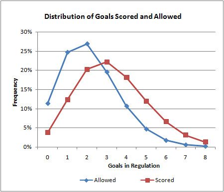
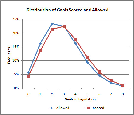
We can go further and apply this to specific teams. For example, the Boston Bruins, which are currently the NHL's top team, score 3.3 goals/game and allow 2.2 goals/game. Their distribution of goals scored and allowed for a single game are plotted below. As you can see, the higher goal amounts are obviously going to be more common for goals scored than allowed.
How is this useful? We can calculate the Bruins' expected winning percentage by summing the probabilities of all the possible combinations of outcomes--1 to 0, 2 to 0, 2 to 1,...The cumulative probability of all outcomes in which the Bruins outscore their opponents reveals an expected win%, similar to the Pythagorean expectation developed originally for baseball.
Using this method, the Bruins can be expected to win 60.0% of the time outright. In 15.8% of games, they can be expected to be tied at the end of regulation. Overtime in hockey is a single 5 minute sudden death period followed by a shoot out if necessary.
OT outcomes are far more random than the rest of the game because it's not who scores the most; it's who scores first. Besides, a tied game in regulation suggests the teams are relatively evenly matched, at least on that day. So for now, let's say the Bruins will win half of their OT games. They should be a .679 team, and in fact, they're currentlly at .642. We might say, if anything, they're a little better than their record indicates.
In part 2, I'll describe a method for estimating game probabilities for particular team match-ups. But before I sign off, I want to be clear that I doubt anything I've done here is original. I know for a fact that hockey analytics guys use Poisson modeling extensively. And I doubt this has much relevance to football. In fact, that's the point. It's unlikely that there's much about football that is Poisson, and that's worth understanding (if true). Besides, I like to investigate what make various sports unique.
NCAA Basketball Win Probability
 Live win probabilities for NCAA basketball games are now available at wp.advancednflstats.com/bball. The model's approach is very similar to my football model. Basketball is a much simpler sport, though. There's no field position, down, or distance in basketball. Score and time remaining are really the only significant factors.
When the NFL season ended, I still had a framework for real-time win probability graphs. All I needed to change was the data and model behind it. In fact, I could pretty easily do it for other sports such as the NBA, NHL, or even MLS. I'm not planning on launching AdvancedBballStats.com or anything. This is all just for grins.
I've written up some details on the model at a guest post over at Dave Berri's Wages of Wins site. Comments and suggestions are always appreciated.
The NFL without a Salary Cap? 2
 In my last post, I looked at how the NFL might change if the salary cap expires as it's set to do in 2010 unless extended. I looked specifically at within-season parity levels, or how close together teams are in terms of competitiveness. We saw that the salary cap era was not noticeably different from the pre-cap era.
In this post, I'll look at the cap in terms of year-to-year parity--the tendency for bad teams to improve and good teams to decline. This is the kind of parity that would tend to prevent either dynasties or perennial doormats. It's the kind of thing that gives fans of every team hope going into September. It follows that a salary cap system would prevent teams from hoarding the best players and we'd expect to see parity levels increase.
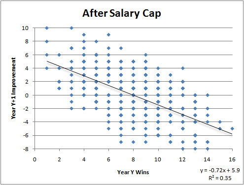
For both the pre-cap and cap eras*, I took each team's season win totals and plotted them against the improvements or decline in wins the following year. I then plotted a simple linear regression line for each era. This illustrates the "churn" of team records--how much bad teams get better and good teams get worse.
To interpret the charts, consider this example. Before the cap, a team with 2 wins one year could expect to win about 3 more wins the following season, going 5-11 on average. After the cap, a team with 2 wins can now expect to win about 4 more wins the following season, for an average record of 6-10.
Notice that the slope of the regression line for the cap era (-0.72) is singificantly steeper than the slope of the line for the pre-cap era (-0.54). This indicates that year-to-year parity has indeed improved since the salary cap. It's easier for bad teams to improve and harder for good teams to stay on top.
The R-squared for the cap era is also stronger than for the pre-cap era (0.35 compared to 0.27). This indicates that in the cap era not only do team's year-to-year fortunes change to a greater magnitude, but more reliably and predictably too.
So we can say that yes, although the salary cap has made little or no difference in the within-year parity of team strength, the cap has made a difference in the year-to-year churn of improvement and decline. The end of the salary cap would likely reduce that parity to pre-1994 levels. Whether that's a good thing or bad thing, or even if the difference is big enough to matter, depends on your point of view.
The most important thing about parity though, isn't really the effect of the salary cap, but how important is it in absolute terms. In other words, how strong is the parity of the NFL compared to what an "optimum" level is. I'm not suggesting we can determine that, but I think the idea that every fan can have realistic hope in training camp is an important ingredient in the overall success of a league.
Major League Baseball seems to be on the opposite end of the spectrum. For about 10 years, you could reliably predict the standings in the AL East, not by the All-Star break or even by opening day, but by September of the previous year. You could make the case that half of MLB's playoff spots were effectively determined before the first pitch of opening day.
There are two numbers in the NFL very important to parity I haven't mentioned yet, and those are 16 and 4. There are only 16 games in the NFL season, which helps parity because luck plays a more decisive roll in season outcomes than if the season were longer. (I often use the analogy of playing Kobe Bryant in a 3-point shooting competition. If it's 'best of 3,' sometimes I'll win. But if it's best of 100, I'll never beat him.) And 4 is the number of teams in a division. To make the playoffs, a team doesn't have to outdo 5 or 6 other teams, it just has to outdo 3. So while the cap's effect on parity levels might not be very large, the current league structure creates the illusion of greater parity.
*I defined the pre-cap era as 1978 through 1993, excluding the strike years of 1982 and 1987. I also excluded the year-pairs surrounding the strikes. In other words I did not include the improvement and decline of teams from '81 to '83 or from '87 to '89. I defined the post-cap era as 1995-2008, excluding the first transition year of 1994. Data is from PFR.